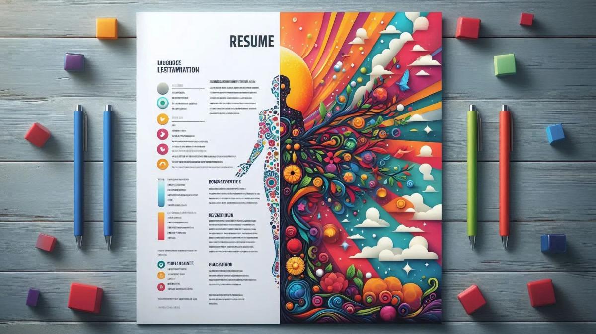
Balancing Creativity and Logic - The DO's and DONT's of resume writing
Jul 24, 2024. By Samona Sarin
Crafting an Effective Visual CV: Balancing Creativity and Logic
In today's highly competitive job market, making a strong impression is crucial. While traditional text-based resumes are still important, a visual CV—also known as an infographic resume—offers a modern and creative approach to presenting your qualifications. However, crafting an effective visual CV isn't just about eye-catching design; it requires logical organization and clear communication. This blog delves into the do's and don'ts of resume writing and highlights the advantages of resume writing services in India.
Why Logic Matters in a Visual CV
A visual CV combines visual elements with textual content to present your qualifications in an engaging format. However, without a logical structure, even the most visually appealing resume can become confusing or overwhelming. Balancing creativity with functionality is key to ensuring that your visual CV is both impressive and informative. Here’s how to achieve that balance:
Key Elements of a Logical Visual CV
1. Structured Layout
A well-structured layout is essential for guiding the reader through your information effectively. Here’s a breakdown of how to implement a structured layout:
-
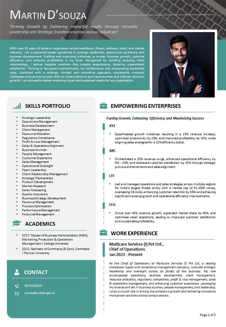
Professional Summary: This section is your chance to make a great first impression. For example, “Experienced Marketing Professional with a proven track record in social media strategy, brand development, and campaign management.” Your professional summary should be concise and clearly outline your career goals, key strengths, and what you aim to achieve in the role you’re applying for.
-
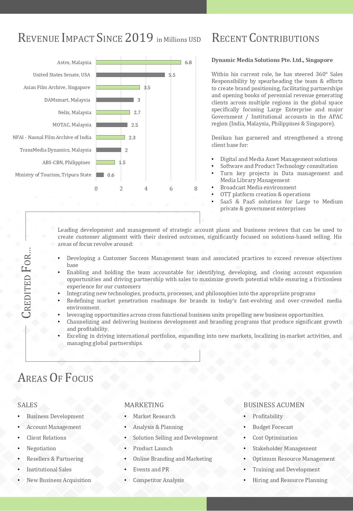
Skills: Visual elements such as icons, bar charts, or skill matrices can help illustrate your abilities. For instance, a bar chart can indicate proficiency levels in various software tools, helping to visually represent what you bring to the table.
-
Experience: A chronological timeline is an effective way to present your work history. For example, you might illustrate key milestones in your career, highlighting your roles and achievements in a linear format. This not only shows your career progression but also emphasizes the impact you’ve made at each position.
-
Education: Representing your educational background with icons or badges can make this section more visually appealing. For example, use graduation cap icons for degrees, and a ribbon icon for certifications. This provides a clear visual summary of your academic qualifications.
2. Consistent Design Elements
Maintaining consistency in design helps ensure that your CV appears professional and is easy to navigate. Focus on the following elements:
-
Typography: Choose fonts that are easy to read and limit yourself to one or two styles to avoid clutter. For example, use a bold font for headings (like section titles) and a simpler, legible font for body text. This distinction helps in organizing content effectively.
-
Color Scheme: A cohesive color palette can enhance the visual appeal of your CV while ensuring readability. For instance, a combination of calming shades of blue for the background, with contrasting colors for headings or key information, can create a professional and attractive look. Avoid using too many colors as this can be distracting.
-
Graphics and Icons: While icons and graphics can enhance your CV, they should be used sparingly and consistently. For instance, use a uniform style of icons for different skill sets (e.g., a gear icon for technical skills and a speech bubble for communication skills). This uniformity helps in maintaining a polished and cohesive design.
3. Effective Use of Visual Data
Using visual data can make complex information more digestible. Ensure you use visual data effectively by following these guidelines:
-
Accurate Representation: Make sure that visual data accurately reflects the information you’re presenting. For instance, if you are showing sales performance or project results, a bar chart should reflect the true percentage increase or achievement without exaggeration.
-
Clarity: Select the appropriate type of chart or graph for your data. For example, a pie chart is ideal for showing proportions, such as your skill set distribution, while a line graph can effectively illustrate growth or progress over time. Ensure that any visual data is easy to understand and relevant to the job you’re applying for.
4. Balancing Creativity and Clarity
While creativity is a major advantage of a visual CV, it should never come at the expense of clarity. Here’s how to strike the right balance:
-
Purposeful Design: Every design element should serve a purpose and contribute to your narrative. Avoid adding decorative elements that do not add value to the content. For example, while decorative borders might look appealing, they can distract from the main content of your CV.
-
Readable Layout: Ensure that your text is legible and the overall layout is not overcrowded. Use white space strategically to avoid overwhelming the reader. Adequate spacing helps in making your CV easy to read and ensures that key information stands out.

Real-World Examples of Visual CVs
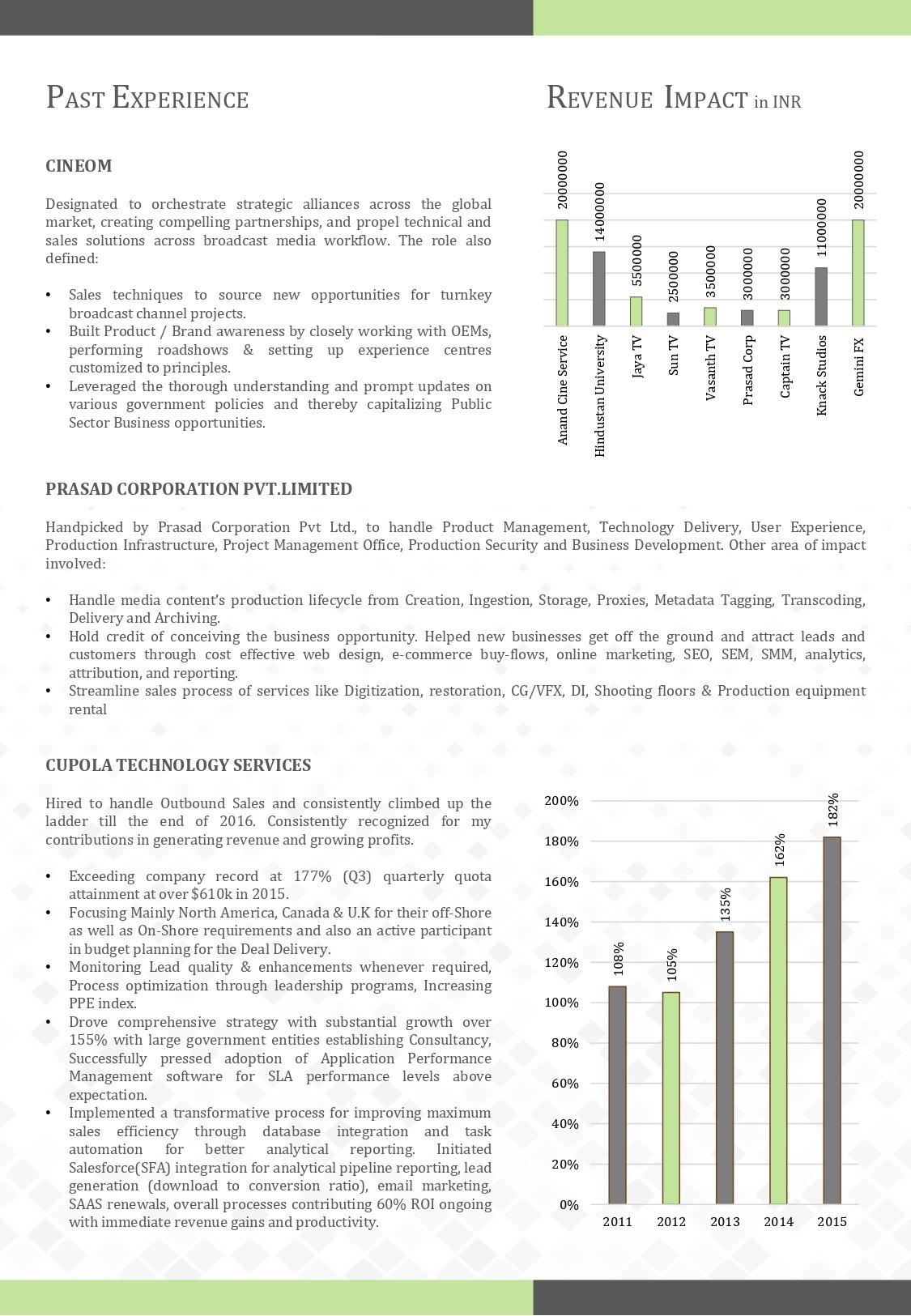
1. Marketing Professional: A CV featuring a timeline of career milestones, a pie chart illustrating skills such as SEO, content creation, and social media management, and icons representing different marketing tools used. This layout highlights career progression and key competencies in a visually engaging way.
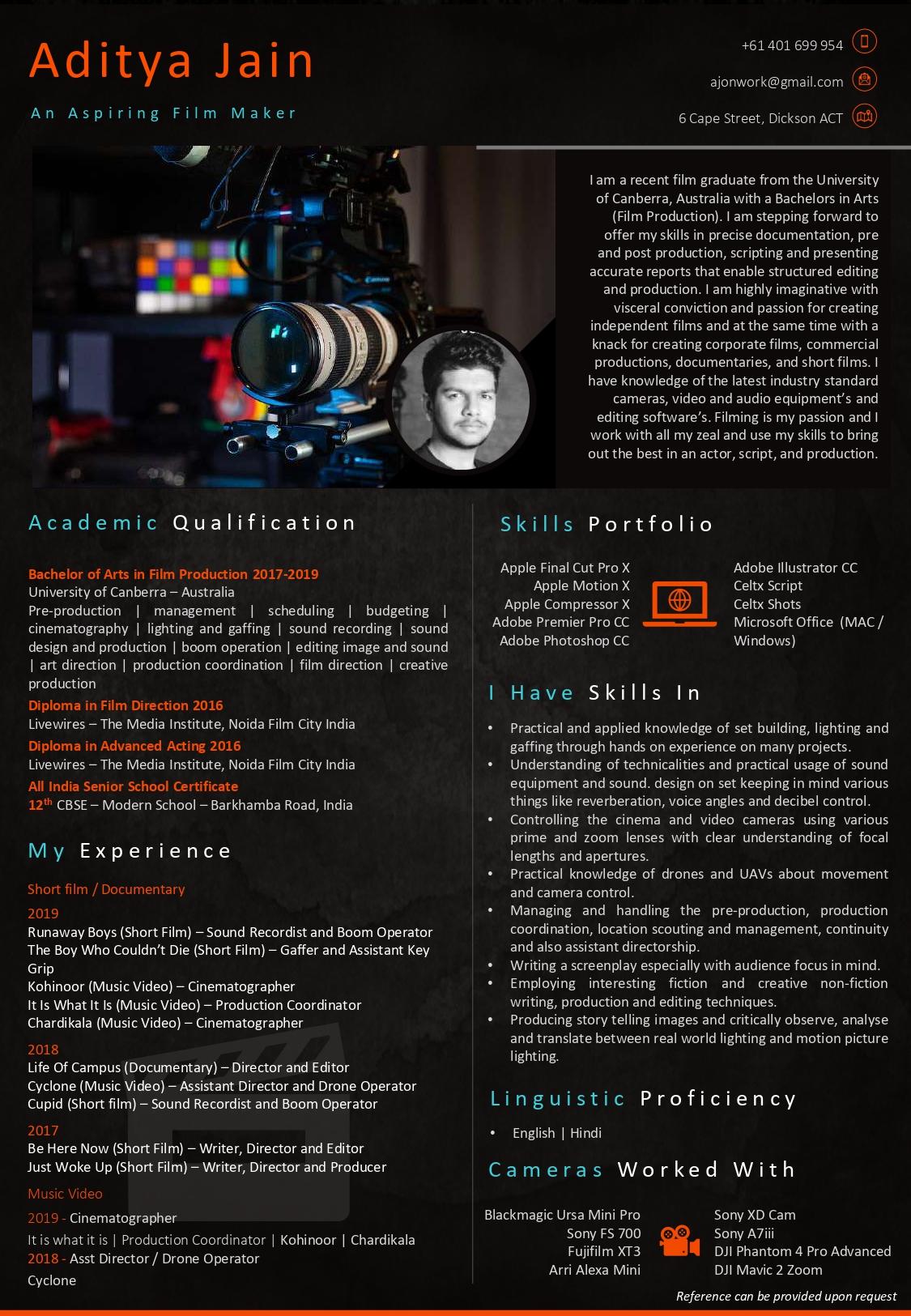
2. Graphic Designer: A portfolio-style CV that integrates images of past work, showcasing a consistent color scheme that reflects their personal brand. Skills are highlighted with relevant icons, and a minimalist design ensures the focus remains on the visual content and design skills.
3. Software Developer: A CV with a clean, tech-inspired design that includes a bar chart showing proficiency in various programming languages, a timeline of project work, and icons representing different software platforms. This format effectively communicates technical expertise and project experience.
Creating a Visual CV: Integrating Key Practices
When creating your visual CV, it’s essential to consider the do's and don'ts of resume writing to ensure your CV is both effective and professional:
Do’s:
-
Do Prioritize Clarity: Make sure that your visual CV is easy to read and navigate. A clear structure with well-defined sections helps in presenting information logically.
-
Do Use Consistent Design: Maintain a cohesive design throughout your CV. Consistency in fonts, colors, and graphics enhances professionalism and readability.
-
Do Tailor Your CV: Customize your CV for each job application by aligning your skills and experiences with the specific requirements of the role. This personalized approach demonstrates your genuine interest and suitability for the position.
-
Do Include Relevant Data: Use charts and graphs to illustrate achievements and skills. This visual representation helps in quickly conveying your competencies and accomplishments.
Don’ts:
-
Don’t Overload with Graphics: Avoid excessive use of graphics or decorative elements that can distract from the content. Focus on visual elements that add value and enhance readability.
-
Don’t Use Inconsistent Fonts or Colors: Avoid using multiple fonts or clashing colors that can make your CV look unprofessional. Stick to a consistent style and color scheme.
-
Don’t Include Irrelevant Information: Keep your CV focused on relevant skills and experiences. Avoid adding personal details or hobbies that are not related to the job.
-
Don’t Neglect Proofreading: Ensure that your CV is free from spelling or grammatical errors. Mistakes can detract from your professionalism and attention to detail.
Creating a visual CV involves more than just showcasing your design skills; it’s about effectively communicating your professional story. By focusing on a logical layout, consistent design, accurate data visualization, and balancing creativity with clarity, you can craft a visual CV that not only stands out but also clearly communicates your value to potential employers.
Remember, this is your story. If you need assistance in presenting it in the best possible way, consider reaching out to experts who can help you create a visual CV that truly represents your qualifications and strengths. For professional assistance in crafting your visual CV, contact CV Designer at sales@cvdesigner.in or call +91 844 844 8780 or +91 9840 226 301. Your resume is often your first impression—make sure it’s a strong one!




ADD COMMENTS
Your email address will not be published. Required fields are marked *